Showing posts with label miriam ward. Show all posts
Showing posts with label miriam ward. Show all posts
Tuesday, 4 June 2013
Sketchbook work - Wassily Kandinsky inspiration
Water colour on hot wax outline painted directly onto plain calico. Annilinky inks used to paint the fabric. Finally the fabric was ironed under kitchen towel to remove wax.
Thursday, 25 April 2013
Part 3 Project 1 Exercise: Subject Choices
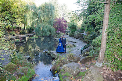
I knew that the Japanese Gardens at Peasholm Park in Scarborough would be the ideal place to paint a range of views to carry out this exercise. Scarborough is somewhere close to our heart as it is where we married 18 months ago. We had some of our wedding photographs taken in Peasholm Park and as we visit Scarborough often its wonderful to see the changing colours and seasons there.
 |
| Miriam & Richard October 2011 Peasholm Park |
The idea of choosing an naming a subject prior to painting it is one which really appealed to me, I am a person who turns words and phrases over in my head, so when I have been painting previously in this and my Textiles courses there is often a title forming in some way or another! I am a little concerned however about the painting outside aspect of this course. I am not sure it is for me, it feels as though I am rushing my paintings and that I do not necessarily have the time or situation to experiment more freely with the techniques taught and learned in the earlier parts of the course, such as washes, experimenting with other elements such as salt and bleach, cling film etc. I do accept though that this section is much more about painting the environment and learning skills to paint quickly and in the moment.
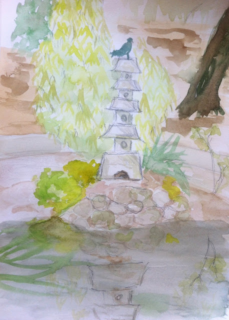
Pigeon, Pagoda, Pond
 |
| Pigeon, Pagoda, Pond |
I think I was drawn to the symmetry of this particular subject matter, I seem to have managed to find another setting incorporating water....perhaps I am drawn to the peace and tranquility of the scene.
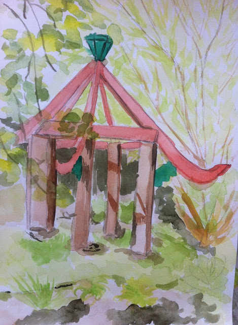
Spring Pagoda
 |
| Spring Pagoda |
For this painting the combination of the pagoda and the bamboo was what appealed to me, the interesting combination of the formal lines of the pagoda contrasted with the loose informality of the bamboo. When I look at this painting I am quite pleased with the success of the shadows which I feel I have been able to recreate. I also think the fast painting approach has ensured it has retained light and freshness as I have not laboured over the painting excessively.
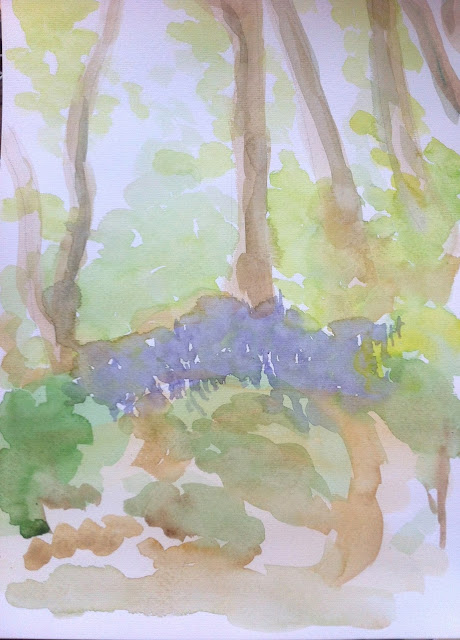
Bluebells
 |
| Bluebels |
This was the final painting of this particular painting session. I think I have taken a more free and less formal approach to this particular study. Not all of the paper has been covered and I like the way this painting has turned out as more of an impression of the scene rather than an accurate representation. I think at time that can be a hindrance for me, I try to ensure my painting look like the "thing" they are meant to be!
Overall I felt this was a valuable exercise, choosing a title meant I could focus on the subject of that title rather than try to include EVERYTHING I could see in my painting, I think this will be a sensible principle for me to refer back to as I continue with the landscape paintings a I am not sure they are really my forte yet.
Monday, 22 April 2013
Part 3, Project 2 Exercise: Exploring greens outside
I have definitely got into the habit of carrying my painting things around me, whenever I think I will a) be seeing a different view to the ones where I live and b) will have the time to sit for an hour to paint. We made a spur of the moment trip to York so the paints came along too, fortunately I have a lovely bag which is large enough to carry an A3 sketchbook so I had no excuse not to have my watercolour things with me. As this exercise was about painting greens outside I spent some time in the gardens of York Minster where there were some beautiful early spring greens, together with dramatic shadows to be seen.
For stage one I painted the lighter tones of green, a combination of sap green and lemon yellow, which was quite a yellowy green for the areas where the sun was very much highlighting the grass and the small mound to the right of the right hand tree. I also painted in the stone tones for the Minster stonework.
Finally I added the shadows using a combination of sap green, cadmium yellow and dark blue. Initially the shadows looked like roots, which I wasn't really happy with, so I decided to paint into the page with a watery brush to remove the definition. I then added in the swathes of purple and yellow crocuses which were bathed in sunlight.
Learning Log Notes:-
 |
| Out and About paint box and notebook |
I tend to worry when I am out of the house with my watercolours that I do not have an adequate range of colours to use. I was pleasantly surprised on this trip just what I could make from the limited pans in my smaller set by simply applying the theory used in exercised 1 and 2 of mixing greens.
 |
| Initial sketch of York Minster, trees, grass and shadows |
Given my viewpoint the two trees and their shadows were dominating my eyeline with the Minster being on my "horizon" I found the quick pencil sketch really helpful in creating a framework for my to lay my paints into.
 |
| Stage 1 |
Learning Log Notes:-
- I think the strongest aspect is the grass, I think I have managed to capture the softly undulating nature of this piece of land.
- I think the weakest aspect of this painting is the background - the Minster. I think given more time I would have liked to have built up this image tonally spending more time on the minster roof and the texture of the stonework, I also feel that I have not adequately recreated the brightness of the sunlit day - an element which was key in creating the stunning shadows on the grass.
- I think the green grid has been key in my approach to the greens, particularly with regards to the introduction of blue or red to darken the tones, leading to such great range of clear and clean tones, rather than just darkening with black.
Part 3, Project 2 Exercise: Mixing Greens 4
 |
| Photograph of bottle arrangement |
 |
| Sketchbook page for testing colours |
 |
| Final painting for Mixing Greens 4 |
I really enjoyed the way this exercise flowed from the previous one, having painted the first two bottles I was really keen to try more green mixing and putting the exercise learnings into practice. I tried to select bottles in various tones of green (I don't drink alcohol so my friends were happy to donate empty bottles!) Again as with the previous exercise I found having a scrap page to test the tones on before applying to my watercolour paper. Looking back at the scrap page I was interested to see how useful viridian was in the mixing of the appropriate colours, but looking further back to exercise 1 I can see just how many tones are based on combinations of viridian. The combinations used were viridian and burnt umber viridian and burnt sienna, viridian and yellow ochre, viridian and alizarin crimson, burnt umber and burnt sienna, viridian and ultramarine, viridian and sap green. I think the overlapping of the bottles meant I had more of a challenge for showing the bottles a viewed through glass.
Part 3, Project 2 Exercise: Mixing Greens 3
For this exercise I worked on A3 paper.
I am continuing to work on 300gsm paper for all of my exercises as I am finding the paint handles so very differently on the lighter weight paper and I want to be able to handle the paint consistently.
These are the two bottles I chose to paint :-
I am continuing to work on 300gsm paper for all of my exercises as I am finding the paint handles so very differently on the lighter weight paper and I want to be able to handle the paint consistently.
These are the two bottles I chose to paint :-
The bottle on the left has far more brown and green tones than the bottle to the right, that has more clear apple green tones. I was also aware of the window frame behind the bottles which gave a distorted white line two thirds of the way down the bottles.
Here is the completed painting, I found that for this exercise I made continuous use of the sample pages created in Exercise Mixing Greens 1. I also made extensive use of a scrap sheet of paper to test the various tones before adding them to my watercolour page. The watercolours I used predominantly were viridian, burnt sienna and lemon yellow, as with this combination I was able to obtain the brown green tones. I found that the method of applying paint in different mixes per the exercise notes the more straightforward (righthand bottle) I think that some of the tones became a bit "samey" through applying layers of darker and lighter tones.
Wednesday, 20 March 2013
Part 3, Project 2 Exercise: Mixing Greens 2
Monday, 18 March 2013
Hyacinth30
I have decided to press on with the idea of creating a painting a day for a period of a month. I think that using this as an opportunity to refresh my watercolour skills is the best way to view it. I considered painting different household objects each day, perhaps in a range of colours but then realised I might be better to focus on one THING then find different approaches to painting this one object. I chose a hyacinth in a glass growing jar. I feel that this best epitomises my passion for gardening, nature and colour but also has some challenging aspects and interesting surfaces due to the transparent glass and the change in perspectives. I think that as the hyacinth dies and decays I will be able to capture that process, but I also have 30 attempts at getting the same thing right!
I have set up a blog page http://hyacinth30.blogspot.co.uk/
And am uploading the photos to my Textiles Facebook Page http://www.facebook.com/MiriamWardTextiles
I have set up a blog page http://hyacinth30.blogspot.co.uk/
And am uploading the photos to my Textiles Facebook Page http://www.facebook.com/MiriamWardTextiles
Subscribe to:
Posts (Atom)


