I knew that the Japanese Gardens at Peasholm Park in Scarborough would be the ideal place to paint a range of views to carry out this exercise. Scarborough is somewhere close to our heart as it is where we married 18 months ago. We had some of our wedding photographs taken in Peasholm Park and as we visit Scarborough often its wonderful to see the changing colours and seasons there.
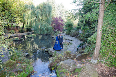 |
| Miriam & Richard October 2011 Peasholm Park |
The idea of choosing an naming a subject prior to painting it is one which really appealed to me, I am a person who turns words and phrases over in my head, so when I have been painting previously in this and my Textiles courses there is often a title forming in some way or another! I am a little concerned however about the painting outside aspect of this course. I am not sure it is for me, it feels as though I am rushing my paintings and that I do not necessarily have the time or situation to experiment more freely with the techniques taught and learned in the earlier parts of the course, such as washes, experimenting with other elements such as salt and bleach, cling film etc. I do accept though that this section is much more about painting the environment and learning skills to paint quickly and in the moment.
Pigeon, Pagoda, Pond
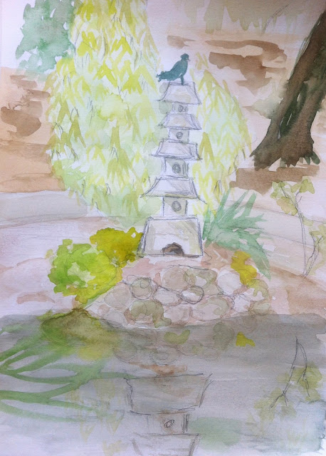 |
| Pigeon, Pagoda, Pond |
I think I was drawn to the symmetry of this particular subject matter, I seem to have managed to find another setting incorporating water....perhaps I am drawn to the peace and tranquility of the scene.
Spring Pagoda
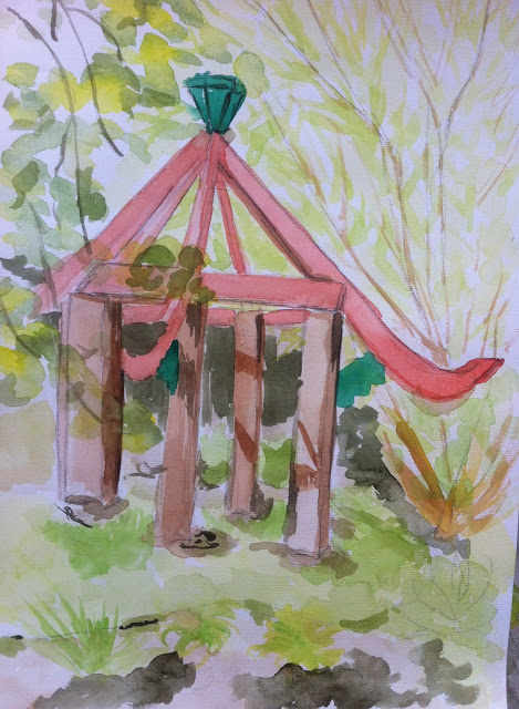 |
| Spring Pagoda |
For this painting the combination of the pagoda and the bamboo was what appealed to me, the interesting combination of the formal lines of the pagoda contrasted with the loose informality of the bamboo. When I look at this painting I am quite pleased with the success of the shadows which I feel I have been able to recreate. I also think the fast painting approach has ensured it has retained light and freshness as I have not laboured over the painting excessively.
Bluebells
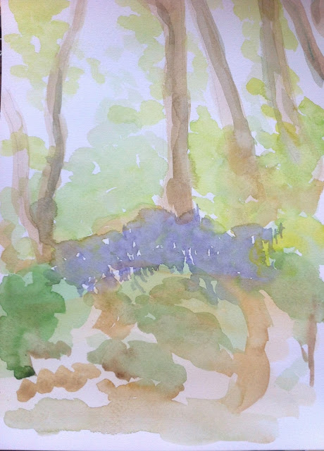 |
| Bluebels |
This was the final painting of this particular painting session. I think I have taken a more free and less formal approach to this particular study. Not all of the paper has been covered and I like the way this painting has turned out as more of an impression of the scene rather than an accurate representation. I think at time that can be a hindrance for me, I try to ensure my painting look like the "thing" they are meant to be!
Overall I felt this was a valuable exercise, choosing a title meant I could focus on the subject of that title rather than try to include EVERYTHING I could see in my painting, I think this will be a sensible principle for me to refer back to as I continue with the landscape paintings a I am not sure they are really my forte yet.


